Colour & decor
Summer's colours
by Louis De Poortere
Summer steps into your home
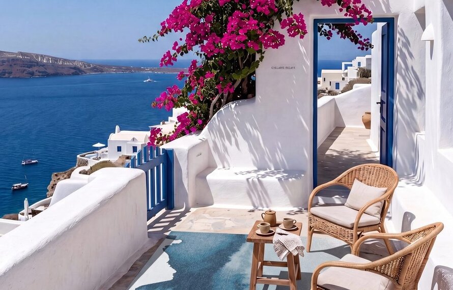
This summer, the most beautiful interiors borrow their hues from the earth.
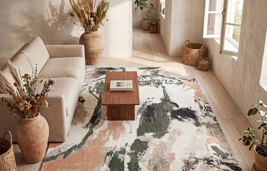
There's something in natural tones that slows the eye down. Not a trend, not a default neutral — these shades have a character of their own, rooted in raw materials and unfiltered landscapes. At Louis De Poortere, this palette unfolds across several directions:
| | Four colour directions for this summer | |
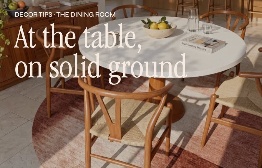
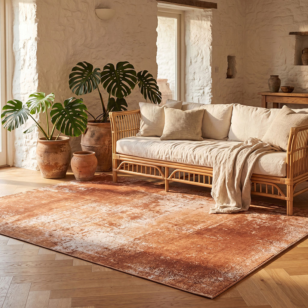 | Ochres and
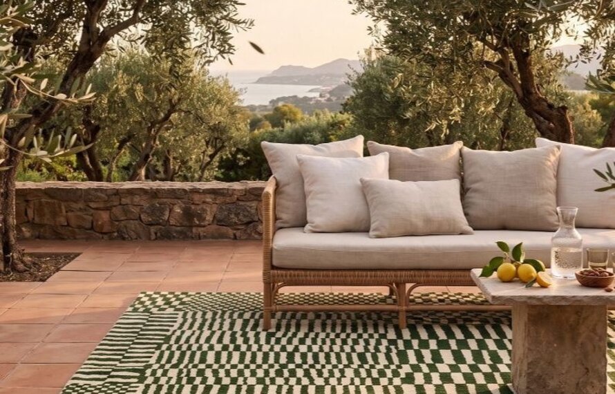
terracottaA muted warmth with an immediate presence. Ideal beneath light wood or rattan furniture — they bring warmth to the floor without weighing it down. Pair with natural linen, rattan and large-leaved plants for an easy summer terrarium feel. |
Slate greys
and natural anthraciteFor more architectural interiors seeking a mineral touch. A grey that doesn't settle for being neutral — it structures, it asserts, it anchors. Perfect with polished concrete, black steel and clean-lined volumes. | 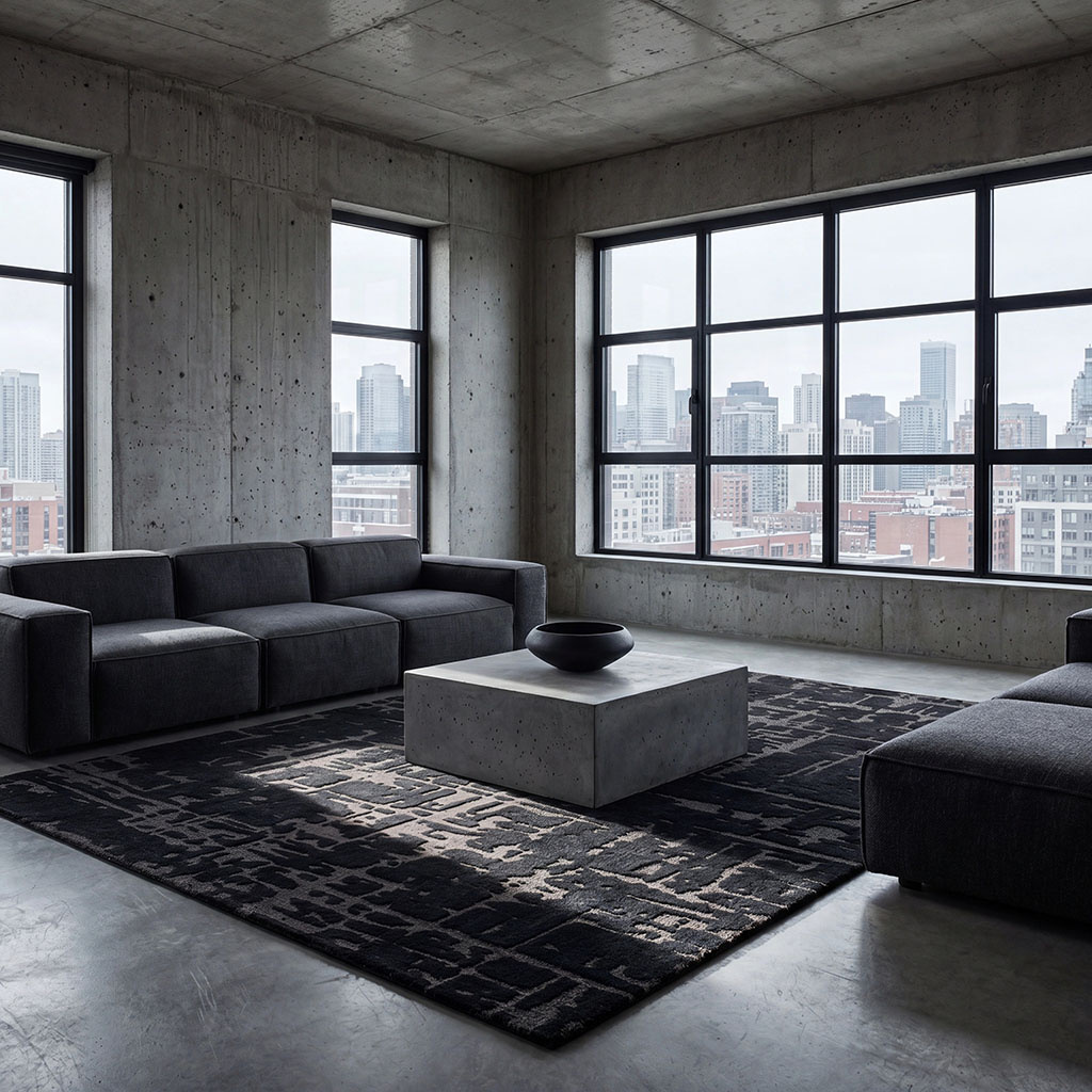 |
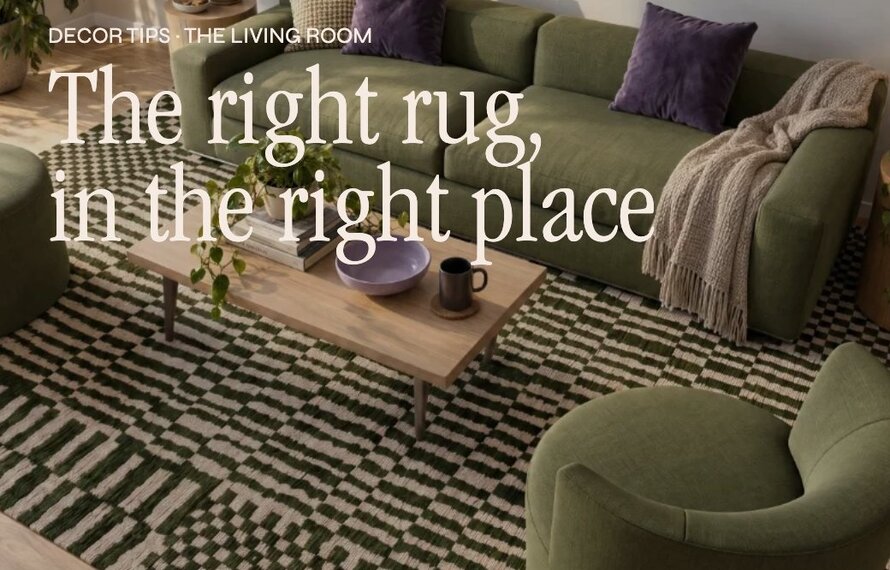
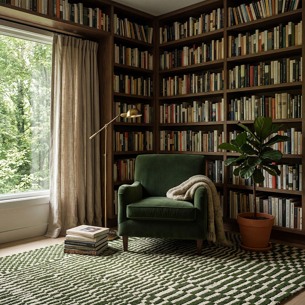 | Moss greens
and khakiUnderstated yet assertive, they ground a space without weighing it down. Khaki green speaks naturally to wood, leather and linen. Ideal for a home office or library — it creates an atmosphere that's both focused and alive. |
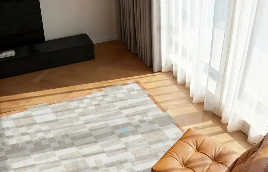
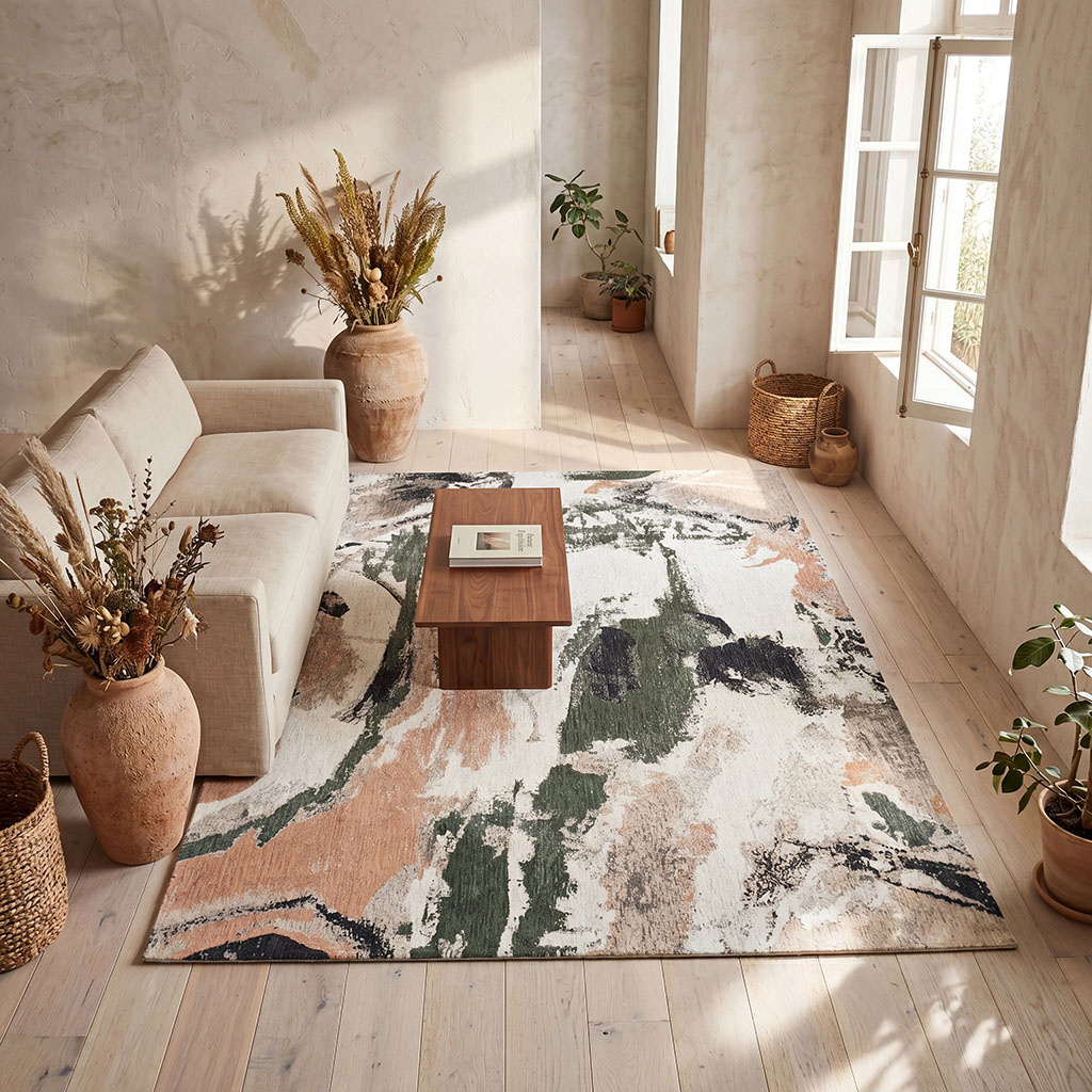
Deep greiges
and sandsThe timeless base that pairs with everything and ages well. Greige isn't an absence of colour — it's a soothing presence that leaves room for everything else. The decorator's safe bet — works in every style, every season. | 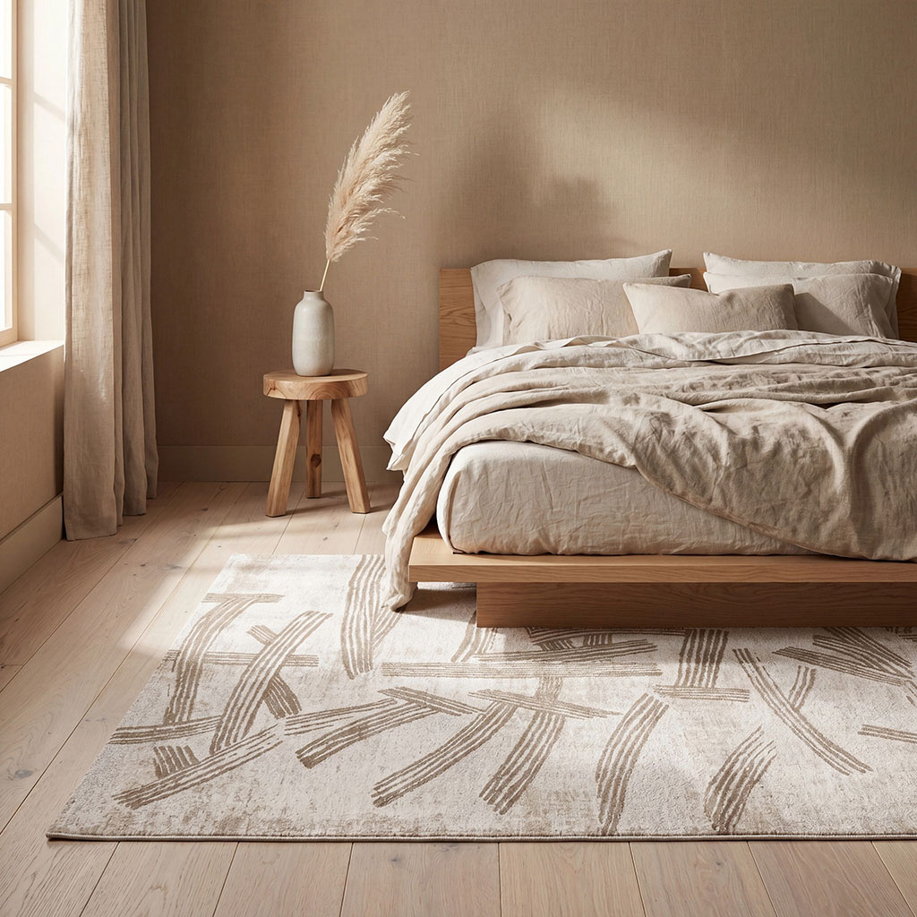 |
More than a rug: the foundation
the whole room rests on.
Explore the full collection and let summer's colours step into your home.
Shop our rugs
Colour & decor — Louis De Poortere
Summer steps into your home
At Louis De Poortere, every rug is an invitation to live in your space differently — with more warmth, more character, more you.
Discover the summer collection
and choose your shade.